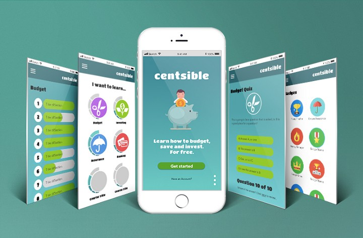
Centsible
Creating Centsible, part 1: Problem Evaluation and User Research.
For improving American’s financial literacy
63% of Americans are considered financially illiterate. Add to that astounding debt growing each day in American’s pockets, and you have a substantial problem.
I and a team of two other designers set about to make an app people could access from their phones. First, we decided who to target.
“Americans” in general were much too broad of a target, since we could never be successful appealing to such a broad range of people. So, I thought about who I knew personally that could use this.
Fortunately, I lived in a college town at the time. I quickly became excited at the idea of addressing financial illiteracy, because many of the students I am friends with, despite being well-educated, know surprisingly little about handling finances. They are terrified of the adult life that awaits them beyond college, and if they have just finished college, they have realized getting a college degree will not immediately make them rich. They want to know more about investing, retirement, life-insurance, and other responsibilities they know are coming, and are embarrassed that they don’t know about already.
I made my argument to the team that this motivated, intelligent, but intimidated audience would be the best to focus on. They have been through plenty of school, they know how to work and study, and they are desperate for more info. Besides, it is common for college students to graduate with a substantial amount of debt, that they are eager to budget for and get rid of. Easy pickins.
“College students have been through plenty of school, they know how to work and study, and they are desperate for more info. They would make an excellent target audience.”
My team argued back that a younger audience is where we would make the most impact, and I agreed. When they are younger they haven’t had a chance to make poor decisions yet. However, I thought a younger audience wouldn’t care to learn the material. This age group would. It is probably the youngest audience we could get, I said, that would really care what we had to teach them.
“… a younger audience wouldn’t care to learn the [financial] material. This age group would.”
Then, having chosen our target audience, we started with a survey. To get to know them better.
To view my full article, with a sample of our survey questions, click here: CentsibleMedium. However the long and short of it was this:
“Across the board, the answer to their problems was always education. They wanted to learn more, from a reliable structured source, and they wanted it to be interesting and interactive,”
I created this persona to help us focus on the user’s goals.
Creating Centsible Pt 2:
Wireframes
After research, the next step in our development process was to organize an app. On sticky notes, we wrote down the goals of our users, and then wrote down the process we thought the user would go through to accomplish their goals. Then we put them up on the wall, and through the process of card-sorting, began eliminating any pages we thought unnecessary.
User Story Mapping
This decision, about what to include in the app as far as pages, was the most difficult part of the process by far. Communicating our ideas, staying true to the goals of the users, and making the final decision between creating an educational or budgeting app, took most of our time and mental power.
I argued for the educational app, saying that our users wanted more than just an option for tracking their expenses. While the other part of the team began building a budgeting app, I started wire-framing for an educational app.
I called some of the college students and asked them their opinion again. Would they rather have an exceptional budgeting app, an investment game where they could make investments with fake money, thereby getting experience with investing with no consequences. Or, an educational app, where they could get a superficial knowledge of many subjects.
Out of 7 users, all said the budgeting app was their last choice. Unless we could do it better than all of the other options out there, they would probably not use it. The investment game appealed to some, but to others the game-play aspect was too juvenile. Overall, the clear winner was the educational app, that taught a basic level of many subjects.
“I called some of the college students we had previously surveyed and asked them their opinion again…Out of 7 users, all said the budgeting app was their last choice. Unless we could do it better than all of the other options out there, they would probably not use it.”
When presented to our class, the consensus was clear again. Education was the route to go. It was unique, not too difficult to build, and closest to what the users wanted to accomplish their goals.
The original wireframes I created looked like this:
Round 2 we put into gray-scale, and the team participated in the development of more pages.
Gray-scale Wireframes
After this, we were ready to make the pages a working prototype, and do the final designs in color!!
Using the programs sketch, adobe illustrator, and photoshop, I created the badges, and other graphics included in the final product of Centsible. I chose and implemented the color scheme, and in the program invision, spliced the pages together, creating a flow of the pages for users to try, and for the presentation of the final production to stake-holders. And with that, the app was ready to be programmed!


