Domo's Mobile Onboarding
If someone like me, a tech designer with two Bachelor of Science degrees couldn’t figure out this app, then who could?
Domo is a large product. Ok, huge. We like to tell our customers, it is seven start-ups in one, because of all the features. While this is really cool, it also can get really complicated, and at times, overwhelming for customers. Oh, and me as a new employee.
My piece of the pie was on the mobile team. Our motto is, “Run your business from your phone,” so from the moment I stepped onto the team, I sat down to begin learning how I could do just that.
It was intimidating. I didn’t know much yet about what Domo was supposed to do for me (as a pretend prospective user), though the onboarding process made it clear that I was supposed to be very impressed. I also wasn’t familiar yet with the web version of Domo, so I didn’t have that to reference either. The reality was, I felt like I was dumb, because I couldn’t understand this product.
As I came to myself, however, I realized, that me feeling stupid was not a flaw in me, necessarily. It was a flaw in the onboarding process. I never felt dumb when starting other apps, granted apps like Instagram weren’t handling such huge amounts of data. And if someone like me, a tech designer with two bachelor of science degrees couldn’t figure out this app, then who could?
It needed some re-design work. Ultimately, I came up with the following presentation that I gave to the VP of our company in August of 2018.
Users generally have just one job they need to do. Domo has so many fantastic functions, it’s like a Swiss army knife you are trying to use for just one simple job. It’s more than they need.
Right now we do very little to help users understand how to be successful in the app. People are either wasting time in the app or leaving the app altogether because they don’t understand the core concepts of mobile.
(By far the most difficult part of the process, was coming up with this business problem.
Coming up with the business problem took two of the three months.
I presented the problem to our product manager and our developers several times, and took it back and changed it according to their feedback. It went through several cuts and iterations, even after I was sure it was perfect.)
As a team, Mobile came up with three aspects to address this problem of poor understanding within the app. Addressing these three issues we believed would help users decrease their Time To Value, or in other words, gain value from the app faster.
I knew the web version had it’s own system set up to help with core concepts, called Domo Skills, so I set out to interview everyone I could find that had been involved in creating Domo Skills, Freemium, or who might just have an insight into the users’ current feelings on the subject at hand.
(These three were my main sources, but altogether I interviewed around 7 or 8 people around the company).
This data above is addressing the onboarding process Mobile has currently taken from cards curated within Domo of our own data. Just a reminder, the Interstitials are five different pages that come before you can login. They are kind of a selling point trying to explain what Domo can do and how it can help your business.
This data, again, is about users going through the initial sign-up process. It shows in general, that the interstitials (the core element to our current onboarding process) are barely looked at. Which, might have various reasons and isn’t necessarily a bad thing until we drill deeper into this card.
So while maybe this data is watered down by web users who are downloading mobile, it still shows the interstitials are not terribly useful for initial users.
Proposed Solution: Take users on a delightful walk through the core concepts within the app to decrease their TTV.
This, plus using personal or relatable data to hook the attention and demonstrate the value of Domo. We found that when we used data the users recognized, they were much more eager to explore and it was much more intuitive for them.
So who is going on this walkthrough?
All these users are going down the golden path together, because we realized that the core concepts inside the app are the same for most everyone.
Because Mobile’s primary use is data consumption, we should focus in the walkthrough on the basics of consuming data within the app.
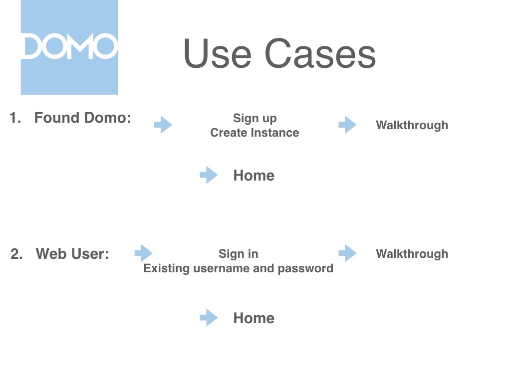
On the other hand, I also wanted to introduce that the thing that is different between our users, is the way that they enter the app for the very first time.
Here is an illustration of the four different scenarios we found under which users could enter the mobile app, and the process they would go through.
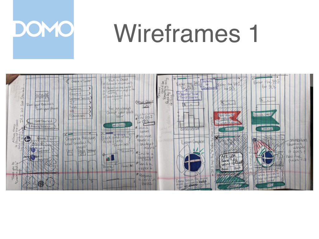
So after outlining these use cases, I got to work wireframing a basic walkthrough. I’m gonna show you my process in developing the walkthrough. First, I looked at different apps like Lake and Duo Lingo that had good onboarding experiences, and drew out some rough ideas on pen and paper.
Next I cleaned them up. I showed these wireframes to my product manager and design team lead, we narrowed down what we thought were the core concepts users needed to know. The objects here in red rectangles are features that could be demonstrated later on with snackbars or maybe a small shaking animation.
Now again, before I show you the walkthrough our #1 job on mobile is consuming data on cards and dashboards.
Click above to see a video of the walkthrough example I put together.
Here is an example of what the walkthrough could look like. In the research people didn’t understand the fundamental unit of the card, or how cards made up dashboards or pages, so we decided a blatant introduction like this would be beneficial.
Again, we are coaching users in how to consume the data.
Dynamic zoom shows the zoomed in data in context.
Drilling is more intuitive when it is done with data that you recognize.
This is showing how many cards make a dashboard.
Since you can’t create cards or dashboards on mobile and this point is currently unclear within the app, we decided in the walkthrough we needed just a little plug to point users toward the web.
As I talked with Paige, we thought that the home screen was one of the coolest features of mobile, and was also unique to mobile, so that could do with an introduction.
Last of all we wanted to show them where they could find more help.
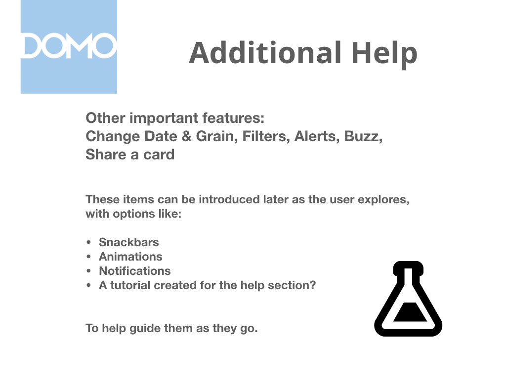
Since there are other important things to learn that are not “essential” per se, I wanted to at least mention them, and how they could be subtly introduced as the user explored around.
Then, finally, the user should explore the rest on their own, and set free!


