ASEA Business Coach
Building an app for ASEA Associates
This is an ongoing project that I am LOVING. So far I have wireframes and a few more developed pages within the app.
BEFORE:
AFTER:
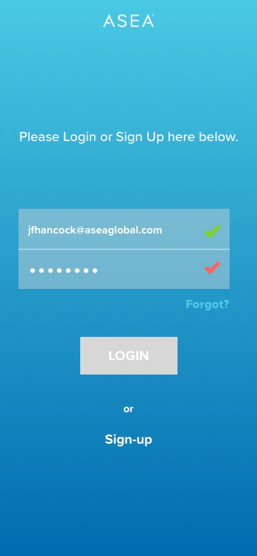
Login
Homepage
Navigation
This is a quick prototype I put together in Keynote, believe it or not! It is for our developers, to demonstrate how I imagined the contact list unfolding.
Rejected Contact icon designs:
Zero States
From Contacts to Messaging Transition
I wanted to show here, that at this point, I was really thinking harder about the icons I had put in the bottom nav. The alerts icon I decided, was only an on/off feature, and could therefore go in settings rather than take up valuable real estate.
The Above notes to myself
Because they are hard to read on those images. These are essentially my thoughts as I go through the design process.
“How do they add a new contact?
Maybe it could be within settings? No, I’m pretty sure it should be easier than that. Put it in the place of alerts!!”
“Do alerts and messages really need to be separate?
First of all—do they have different goals? Yes. So they should be separate. The goal of the alerts icon is to notify you to contact people in your lists regularly. Maybe it should be a function in settings then? Since you just turn them off or on, and don’t need to interact with it every day. It could have a (1) circle by the home button to indicate you have unseen alerts.”
“Why is the contact button in the center of the nav bar?
Because the point of the app is to keep up with your contacts, not to track whatever is on the homescreen. THOUGH with that said, maybe the homescreen should BE your contacts list. (No, I think it should be something inspirational. A feed? A graph?)
Another reason it is in the center is because it will be the most common action taken, also it is the one that opens out into many options. “
Group Messages
“If I were supposed to be contacting a lot of people every day, I would want a function where I could message many people at once. Maybe even make “groups” of people that I can send one resource, and another group that I can send another resource. But I would want it to appear that I sent it individually otherwise it will feel like spam to the people receiving the resource. SO. One message that goes out to X number of conversations, and (maybe) even inserts the person’s name into the right place? For this I would put up a LARGE unmissable tooltip (for our users) to inform them: Make it Personal: You are writing one message to many people, if they put @name in place of the name, the app will automatically insert each person’s name in the text as it appears to them.”
Rejected Group Messages Ideas:
I kept these in case another designer had a way to make them work, since selecting multiple people from the beginning would be convenient.
Note: Also, There is no point in showing a hoverstate on an app as demonstrated here, especially not with a cursor. Since you don’t hover with your finger, and there will be no cursor on someone’s screen while they are in the app. SO hoverstates are out.


