Checkout: Progressive Leasing
The Problem:
This project began, largely because our company is a leader in the lease-to-own industry. We therefore come under the most scrutiny in our field, as far as compliance with State and Federal laws. For this project we wanted to get ahead of any complaints we had received from the Federal Trade Commission (FTC) or others, and make our product exceptionally, extremely transparent.
To make this happen, we had multiple goals.
Reduce phone calls that came to Prog after a customer completed a lease.
Meet the needs of our own compliance department and the FTC.
Improve the overall customer satisfaction.
All of which would indicate, that the customer had fully comprehended exactly what deal they were making, at the time they signed a lease with us.
Research and Discovery:
We wanted to find data to support our assumptions, in measurable ways. First, we wanted to see how many customers called back with complaints after singing their lease, and why. As we consulted with our Business Analysts and Customer Support workers, we began to get a picture around what their main issues were.
Top Comprehension issues:
Did not understand 12 month cost of leasing
Did not understand 90-day purchase option amount
Wrong information/lease terms not explained
Lease terms not understood.
This gave us a good base to start re-designing our experience on.
Mood board and inspiration:
Progressive Leasing has a fantastic Design System developed, called GRIT. I wanted to implement the GRIT principles, but to do discovery and take inspiration from what other companies/individuals had done.
Information Architecture & Journey Maps:
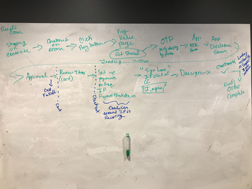
The next step was to plot out our current checkout flow, and then to iterate, and see what other forms of presentation may be more effective. We had two basic ideas based on how other companies had done their work—to do a series of comprehensions screens wither at the beginning of the checkout, or later on and just before final checkout.
Wireframes:
We tested some screen mock-ups on usertesting.com to verify our guess, that placing the comprehensions screens a little farther down in the flow, would be effective. These did indeed test well, as we decided on a final IA flow to base these wireframes off of.
Iterations
There were of course multiple iterations of the designs, before the final pages were chosen. Much of this revolved around selecting available content, keeping everything on brand, and working with other designers getting feedback.
Final Mocks:
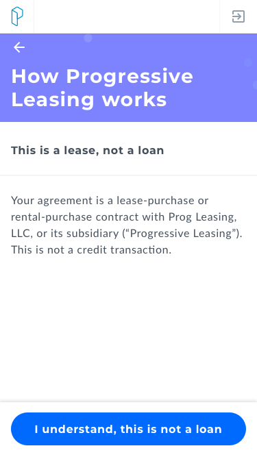
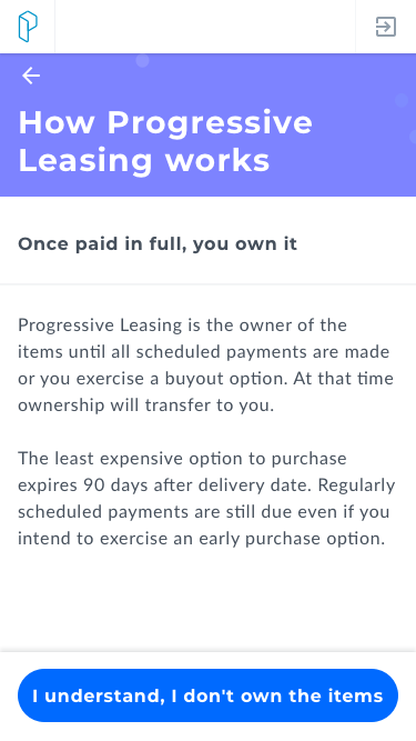
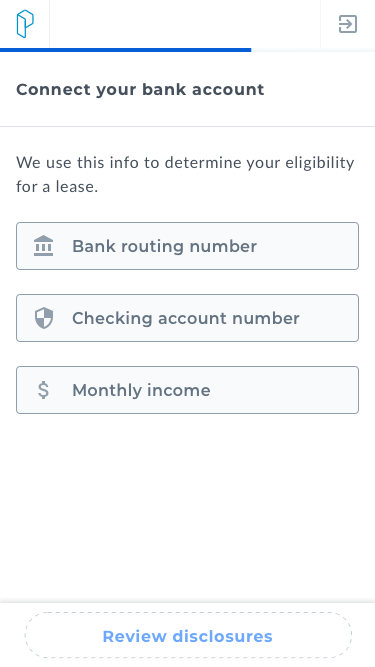
I put together these final mocks with several needs in mind.
On Brand. A process that utilizes our design system.
Consumable. I am a big fan of clean and minimalist pages, with only as much information on one page as is relevant to one piece of information.
In line with our current checkout flow. Aligned around the Information Architecture set up in step 2.
Effective Comprehension. Place buttons that a user can tap to indicate when they understand, or when they need more help.
The Results:
Our new process rolled out, with a warm reception from our customers, who responded with ~75% saying that the transparency made us significantly more trustworthy. (The 25% thought it made the process too long, which is also valid). Then, despite the pandemic, our number of leases increased by 13% this year. (With many customers saying they used our product because of the stimulus package) and ALSO in spite of that fact that we then received a mandate from the FTC that had been in the works for years, about updating certain checkboxes (in spite of our previous efforts).
What would I do differently next time?
Next time I would question more about why we were doing this project, and if I found out it was because the FTC might come after us, then I would do more to ask what exactly the FTC wanted changed, before I jumped in to make my own fixes. It appealed to our customers well, but I think I was unaware of an additional persona that needed to be catered to.


